
Aquascaping analysis of Project Ryuboku by Pawel Mielniczek
Introduction
This month, I have the honor of analyzing Project Ryuboku by Polish aquascaper, Pawel Mielniczek. When I saw his posting in Aquascaping World, it’s melding of styles, simplicity, and openness struck me. I immediately reached out to him to see if I could analyze it.
The term “ryuboku” has been used more and more in the aquascaping world when referencing a layout style where driftwood and rocks are present and form the hardscape. Ryuuboku means driftwood in Japanese. In my opinion, it isn’t a different aquascaping layout style, but rather it’s a technique used within a style. In this aquascape, Pawel uses it masterfully to depict a wonderful scene.
At over 4,000 words, this analysis is a long one. Grab a cup of your favorite coffee or tea (beer is also nice), sit back and relax.
Summary for the time-limited
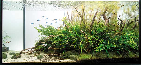
To me, Project Ryuboku’s use of microsorum was critical to convey that wild, natural look. The fine leaves of the plants give it a nice texture. I like it that Pawel had the restraint to use very few plant species that makes the overall aquascape look natural. When an aquascaper is going for a wild look, using too many plant species makes the artwork seem more like an out of control mess that you would never find in nature.
The use of driftwood enhances the natural feeling and gives some backbone to the plants. I find that the quantity used by Pawel is impressive because it adds difficulty to creating the aquascape. However, the complexity that it gives the end result makes it worth it. That masterfully placed piece of thick driftwood in the upper right creates a secondary focus point that adds interest.
Pawels use of color makes the end result look natural and pleasing. Contrast is kept to a minimum through the use of adjacent colors. Interest is really generated through texture, mostly via the use of microsorum. I’m still debating whether adding red plants to the background would have made the aquascape more dynamic. The answer is probably yes, but then that would change the feeling Pawel was going after.
Finally, Project Ryuboku is a great example of a hybrid aquascape that takes from a couple of styles to make something different and new. I definitely see some aspects of nature aquarium style here in that the mass of plants resemble a forest with tree trunks sticking up the top canopy. The fish convey a sense of birds with their movement and scale. However, the piece also definitely has an undertone of biotope style because it’s choice of few plants and adjacent colors makes it look very natural like a real habitat would. Lastly, it’s strong triangular layout clearly indicates Pawel intended to use that style to frame the composition.
Initial impressions
What is the first thing you think about when you’re admiring an aquascape? That’s the question you must ask yourself. In my case, the first thing that popped out at me is the word “triangle“. I have often written about how our brains are hardwired to think in triangles and patterns and Project Ryuboku certainly is a triangular layout. In fact, I would say it’s close to a textbook example of a triangular layout with the correct balance of negative and positive space.
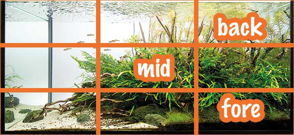
The next thing I felt was the simplicity of the piece. The aquascape uses few plants to convey a more natural feeling. Also, the division between foreground, middle and back is very well defined and easy to identify. It’s not a complicated composition, especially because it relies so much on the single, right leaning triangle. Color too is kept to a minimum with green and yellow dominating. Adjacent colors, like green and yellow, harmonize well with each other conveying a feeling of tranquility and belonging.
Once my left brain kicked in, I began asking myself what style Pawel used. It wasn’t obvious to me because Pawel draws from different styles, I think. When you use a strong, compositional layout, such as a strong triangle, aquascaping styles can blur. In this case, I can see hints of a biotope in that a riverbed shore is present. The few plant types are also characteristic of a biotope style. However, I do get an undertow of nature aquarium when looking at the heavy planting on the right and the driftwood towering above it reminiscent of tree trunks. My initial impression is that this is a hybrid aquascape with a very strong triangular composition.
Finally, I tried to imagine where the focal point of the work was. At first, I thought it was the big mass of microsorum and bolbitis. However, my eye caught the thicker driftwood that protrudes up in the right third and it also seemed to be a focal point. I think there may be some competition between these two points that we will see if we can confirm a little later on.
So, with that, let’s get into the analysis and see how my initial impressions faired.
Analysis – how design elements are used
If you are new to my aquascaping analyses, I try to follow a traditional fine art criticism methodology where one introduces/describes, analyzes how the artist used elements of design, interprets to find meaning, and finally provides an opinion or judgement. I have adapted these principles to fit the peculiarities of freshwater fish tanks and aquascaping.
Rule of Thirds
The rule of thirds is really a “rule of thumb” or guideline which applies to the process of composing visual images. It proposes that an image should be imagined as divided into nine equal parts by two equally spaced horizontal lines and two equally spaced vertical lines, and that important compositional elements should be placed along these lines or their intersections. Proponents of the technique claim that aligning a subject with these points creates more tension, energy and interest in the composition than simply centering the subject would.

The above image applies the rule of third to the aquascape. As you can see, the heavily planted area is slightly too centered to sit evenly on the left third. The intersecting points on the left vertical don’t seem to highlight any focal points. Remember how I said that I thought the heavy planted section was a focal point for me? Well, this seems to imply that maybe it would be a more powerful focal point if it were sitting slightly to the right of where it is. This is probably why I have trouble decide what is the primary focal point, the heavily planted area or that thick driftwood piece at the top.
Notice that driftwood piece is sitting to the right of the right vertical. Would it be more dominant if it were slightly to the left, more on the right vertical division? Probably, but that supposes that it was Pawel’s intention to make that piece a focal point.
Another thing that strikes me from looking at the Rule of Thirds application is how nicely the piece depicts a large, right-leaning triangle. Notice how it cuts across the diagonal from bottom left to upper right. I’m sure this will be highlighted later when we discuss the golden triangle.
Golden Sections
The golden section is also known as the divine division, golden ratio, or simply as Phi. It is the ratio of 1:1.618 and it is seen in nature everywhere. It has been used by mother nature, the Egyptians, the Romans, and even Michael Angelo in his painting of the Last Supper. I use it here, along with the rule of thirds, to try to see if the aquascape follows a compositional layout that fits naturally with what we’ve either been pre-programmed or learned to find pleasing. In aquascaping, the golden sections are good to find perspective in the piece and, sometimes, to find symmetry or rhythm.
Applying the sections to Project Ryuboku, we see that Pawel did a good job of placing the heavy side of the work in the right section with sufficient empty (negative) space on the left. You see it? Most of the planting and driftwood is to the right of the left most vertical line in the area that is 1.618.
However, the sections don’t define perspective here very well. I’ll discuss this point further into the analysis when i touch on perspective. For now, just see how the mid ground is sitting between two sections.

Golden Spiral
The golden spiral is a logorithmic whose growth factor is the golden ratio. It can be found in nature in seashells and in the arms of spiraling galaxies. In art, it is sometimes used to find focal points. That’s how I use it. In other words, items placed in the area where the spiral ends tend to be where people focus.
As we discussed above, I felt that the thick driftwood branch sticking up behind and above the plant mass was competing with this mass for attention. I felt it was a primary or secondary focal point for the piece. I’ve highlighted it below in orange. What do you think? Does it draw your eye?

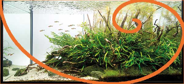
As you can see when we apply the golden spiral to it, it does sit very close to where we may expect to see a focal point. This is probably why I was debating before. It would be a more powerful focal point if it were sitting a bit to the left as we discussed above with the rule of thirds. However, because it’s close to where we would look for a focal point and it is the only thick piece of driftwood, it demands our attention.
Do you think Pawel intended this? Would you have put this singular piece there? What do you think was the point? Hmm… questions, questions. This is what fine art analysis is about! It is as much for you to answer these questions than it is for Pawel. It is in deconstructing works of art that we find deeper meaning and intentions!
Golden Triangles
A golden triangle is an isosceles triangle in which the smaller side is in golden ratio with its adjacent side. Like the other ratios mentioned above, the golden triangle is simply a tool that can assist in placing focal points and in laying out the composition. It’s intersecting points can be focal points.
Project Ryuboku is a strong triangular layout so I figured that the golden triangle may allow us to see things in greater depth and understand why the overall aquascape is powerful. Take a look at the image below where I superimpose the golden triangle onto the aquascape.
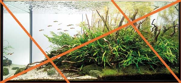
Remember that we were thinking that thick driftwood branch in the top right could be a focal point? Well, notice that it is sitting almost exactly on the upper intersection point. This supports our thinking that it is a focal point. Think about it, though. Did Pawel know this location would represent a focal point when he set up the aquascape? Or, more likely, do you think he did it on instinct or experience? Perhaps, by stepping back and listening to his gut?
This is not easy, my friend. Take a look at what Pawel saw as he built the hardscape. It’s very hard to position that large branch exactly where it should go to produce a focal point. At least, it’s not easy in the beginning before planting or after the plants have grown in. Very well done, Pawel. Impressive.
Now that we’re discussing triangles, I also always like to point out the center of an aquascape. Your focal point should not be there as it, typically, will produce a dull composition that lacks energy. Look at the image below. What if Pawel had placed the planting right smack in the middle in more of an island layout?
Perspective
Perspective is the way in which objects appear to the eye based on their spatial attributes; or their dimensions and the position of the eye relative to the objects. There are two main meanings of the term: linear perspective and aerial perspective. Linear is based on dimension and position relative to the eye. Things get smaller the further away they are. Aerial is based on the concept of looking at things through the atmosphere. With aerial perspective, color becomes important because with distance things reduce in contrast, saturation and more bluer in hue.
In aquascaping, I use the golden sections to carve out the linear perspective as it allows me to segment between the foreground, mid ground and background easily. See the image below. The three segments are more or less well defined. The background is sitting above the top horizontal. The mid is in the middle section, more or less. The foreground sits in the lower section well.
However, I don’t see a lot of linear perspective here. That’s OK. While linear perspective makes the aquarium look bigger than it is by giving it depth, it isn’t necessary and I think in this case, it works. This is not a nature aquarium style where you want great depth and a sense of expanse. This is more of a view of a specific section.
Aerial perspective, on the other hand, I think is represented pretty well. Notice the lighter color of the Rotala in the background. The hue and contrast is much less than the middle and the foreground. This does give a sense of perspective pushing back, at least, the top part of the scape.
I’m not sure about this choice as, to me, it is giving a big difference between the foreground/middle and the background. I’m thinking of a body that is one place where the head is further to the back. I think less aerial perspective here would have worked better but that is simply my choice. What do you think?
I also lump negative and positive space in with perspective. Negative space, or empty space, is very important to avoid creating a feeling of unease. In some aquascapes, the negative space is just as important as the rest of the work. However, I find few aquascapers that really focus on it. Take a look at the image below and see how well Pawel divided Project Ryuboku between negative and positive space.

You can also see negative space by highlighting it as I do below. This allows you to really get a sense of the emptiness and compare it to the areas that contain something. I made everything black except for the empty space that I gave an orange tint to. Do you see how evenly the space is divided?
Use of color as a design element
We discussed the use of color to give aerial perspective above. Color is also used in many other ways in aquascaping. It can convey a mood, work to give symmetry or rhythm, and support a focal point. In Project Ryuboku, I sensed that yellow and green jumped out at me and gave me a big shake. They are the dominant colors. To test this, I pumped up the yellow in the image below. Notice the areas of the aquascape the flame up in yellow as I increased its saturation.

I also wanted to see how brightness worked into the image. I switched to black and white so that I can see all of the areas that represent a very light (bright) color in the aquascape. As you can see from the image below, bright yellow seems to extend from the top to almost the bottom of the work. There’s a lot of yellow at the top and it transitions down to the middle and touches the bottom. This is a good way to meld colors in a non-jarring way. This is in contrast to Dutch style aquascapes that have high-contrast drifts (streets) intentionally.

I also wanted to see how color worked in harmony with itself. To me, the yellow and green dominance created a pleasing and soothing scene, but it left me feeling that the aquascape was not very dynamic. It left me wanting a little more energy. It’s a personal taste thing.
Anyway, as you can see below, the yellow and green dominate the aquascape. These two colors are adjacent colors in the color wheel and typically have a pleasing, soothing effect. Little contrast means little energy and this is perfectly fine if that is what you’re looking for. It is certainly seen in nature and, hence, this aquascape spoke to me as a biotope does. This is something I would see in a natural habitat.

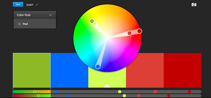
The image below depicts a triadic combination taking some of the colors that Project Ryuboku originally had. As you can see, in a triadic color combination, colors gain more energy because they have more contrast, but are still pleasing when used together.
Taking this triadic combination and applying it to the aquascape may prove to give it that energy that I feel is missing. However, there is a risk that the overall impression of the work will change if I were to add this color combination. Let’s see. In the image below, I changed the yellow Rotala to red. This does two things- the aerial perspective is much less because now the Rotala stay closer to the body of the aquascape rather than recede. Also, the red and green combination is more dynamic. How would you describe this new aquascape compared to the original one that used yellow in the background? Is this more to your liking or less?
Remember that large driftwood branch in the top? Is it still a focal point? Hmmm? Why is that?

You may be wondering how I would get blue into the composition? Via fish, of course! In the image below, I took the liberty of metamorphosing the Hemigrammus to neon tetras. I could also have used slate stone that tended toward the blue hues.
Details
What’s that saying? The devil is in the details? Well, that doesn’t apply to aquascapes. I prefer the older version “God is in the details” that means that little things matter a lot. This does apply to aquascapes.
Look at the image below and notice the texture of it. Detail creates texture, here, in the forms of the leaves. By highlighting them, it is easy to get a feel for the texture and why Pawel chose these plants. Remember, he intended a wild look and this extreme texture delivers.

I was also intrigued at the subtle placement of dark gravel over the whitish sand. Was that intentional or is that the result of the inevitable spillage we all know happens when you use multiple substrate colors? See the image below where I remove the dark gravel. Do you like it better? Stark contrast, no? Unnatural, no?

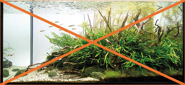
Continuing the thought on details, what if Pawel had not placed that thick branch at the top? What would that have done to the aquascape? See the image below where I remove it. In my opinion, the overall work is less without it so it belongs in there. Good work, Pawel! What do you think?

While we are removing things to see why they are there, let’s go ahead and remove the branches on the left by the shore. What do you think? Although they seem to be minor items that could be there or not, it appears, when you remove them, that they add a lot to the overall feel of the work, right? The aquascape seems more natural to me with them than without.

Heck, let’s try to see what Project Ryuboku would be with the ryuboku! The image below removes the driftwood from the top portion of the aquascape. The piece seems to become less complex and interesting. Clearly, the branches add to the feeling and should be there.

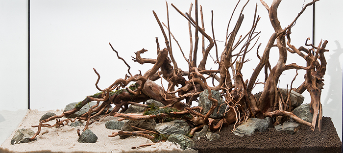
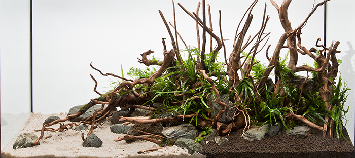
Take a look at a freshly planted Project Ryuboku to see the level of imagination Pawel must have used to be able to determine how many pieces of driftwood to use. This is why it is critically important to have a vision of the final aquascape in your mind before beginning. It will serve as your guide. In this case, Pawel used photographs of nature to help him develop that mental picture.
Interpretation – finding meaning and use of style
To me, Project Ryuboku’s use of microsorum was critical to convey that wild, natural look. The fine leaves of the plants give it a nice texture. I like it that Pawel had the restraint to use very few plant species that makes the overall aquascape look natural. When an aquascaper is going for a wild look, using too many plant species makes the artwork seem more like an out of control mess that you would never find in nature.
The use of driftwood enhances the natural feeling and gives some backbone to the plants. I find that the quantity used by Pawel is impressive because it adds difficulty to creating the aquascape. However, the complexity that it gives the end result makes it worth it. That masterfully placed piece of thick driftwood in the upper right creates a secondary focus point that adds interest.
Pawels use of color makes the end result look natural and pleasing. Contrast is kept to a minimum through the use of adjacent colors. Interest is really generated through texture, mostly via the use of microsorum. I’m still debating whether adding red plants to the background would have made the aquascape more dynamic. The answer is probably yes, but then that would change the feeling Pawel was going after.
Finally, Project Ryuboku is a great example of a hybrid aquascape that takes from a couple of styles to make something different and new. I definitely see some aspects of nature aquarium style here in that the mass of plants resemble a forest with tree trunks sticking up the top canopy. The fish convey a sense of birds with their movement and scale. However, the piece also definitely has an undertone of biotope style because it’s choice of few plants and adjacent colors makes it look very natural like a real habitat would. Lastly, it’s strong triangular layout clearly indicates Pawel intended to use that style to frame the composition.
My opinion
Pawel told me that his intention for the aquascape was to give the impression of a wild island, rich with vegetation. He used photographs of natural landscapes as he was designing it. The aquascape was supposed to be unpredictable, wild and delicate at the same time.
In my opinion, Pawel did achieve what he was going after. I don’t think he meant to have created an island style layout because that would require a central composition with open space on either side. Rather, this is an island shore where we are admiring where the island ends and the water begins.
Every aquascape, when done with purpose and care, conveys something about the artist who created it and about our nature. It has greater meaning than just being an aquarium. With Project Ryuboku, I think Pawel is reminding us that nature, like ourselves, have a wild side that can be unpredictable. However, there is create simplicity and beauty when one takes the time to quietly observe.
To me, Project Ryuboku has a natural beauty to it that puts me at ease. It reminds me that although our lives can get incredibly hectic, there are places where things are simple, untouched and just as they should be.
Thank you, Pawel, for the honor and privilege of sharing Project Ryuboku with us and allowing me to learn from it. Looking forward to your next work of art.
And now it’s your turn, did Pawel achieve what he was going for? What do you think, my friend? Tell me in the comments section below.
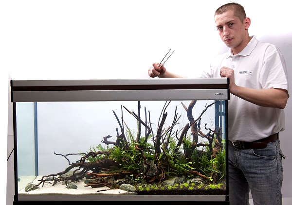
Pawel Mielniczek with Project Ryuboku
Aquarium specifications:
- Aquarium: 100x40x45 cm
- Filtration: Aquael UNIMAX 500, Aquael turbo 1500
- Heating: Aquael COMFORTZONE GOLD 200 W
- Substrate: AZOO PLANT GROWER BED BLACK
- decoration: Rusoko Stone, red mor wood
- fertilizing: Azoo Plant Nutrients, Azoo red plant Nutrients, Azoo 11 in 1 superbiobacteria, Azoo Aquaguard, Easy-Life Kalium Potassium, Easy life Easy Carbo
- Flora: Rotala indica, eleocharis parvula, microsorium trident, microsorium thin leaf, phoenix moss, bolbitis heudelotii, hygrophila japan
- Fauna: Hemigrammus bleheri, Otocinclus vittatus, Caridina multidentata

3 Comments on “Aquascaping analysis – Project Ryuboku”
Pingback: Just like to say thanks for all the help. - The Planted Tank Forum
Pingback: Starting over... a 55 gallon - The Planted Tank Forum
Pingback: Suggestions for Layout - 55 gallon - The Planted Tank Forum